2. Dark Navy: Elegant but Heavy
Navy is often considered gentler than black, but deep navy can absorb light and dull your face.
Better alternatives:
- Royal blue, indigo, cobalt, peacock blue
- Navy with sheen, texture, or slightly brighter undertones
These shades retain sophistication while making your eyes brighter and complexion fresher.

3. Pale Pastels: Light Isn’t Always Lifting
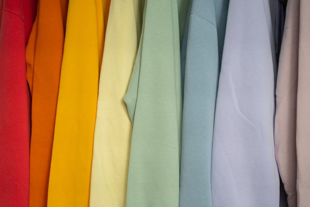
Very soft pastels can wash out mature skin, reducing contrast and making the face look tired.
How to wear them:
- Choose richer tones like raspberry instead of baby pink, or sky blue instead of powder blue.
- Keep pastels away from the face—use them for skirts, accessories, or layering.
- Add contrast with scarves, jewelry, or lipstick.
4. Khaki Green: Practical but Potentially Draining
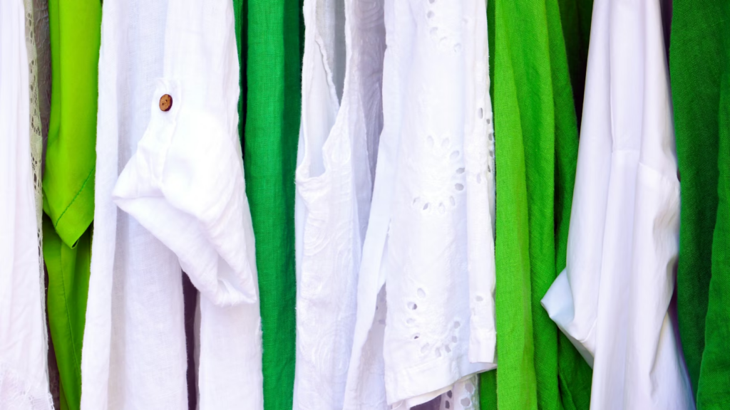
Khaki often contains gray or yellow undertones, which can reflect dull light onto your face.
Flatter with:
- Sage, soft olive, emerald, warm forest green
These tones brighten your complexion while keeping a natural, grounded feel.
5. Neon Colors: Fun but Overpowering
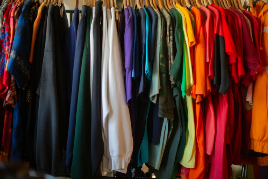
Neon can be bold, playful, and eye-catching—but it can also create too much contrast, highlighting fine lines or shadows.
Smart neon tips:
- Use neon in accessories (scarves, shoes, handbags)
- Try muted or softened versions
- Keep bright shades away from the neckline and face
Choosing Colors That Truly Flatter
Instead of rules, go by reflection. In natural light, ask:
- Does my face look brighter or duller?
- Do my eyes pop?
- Does my skin look rested?
Women over 50 often glow in:
- Warm neutrals: camel, taupe, soft gray
- Rich jewel tones: teal, plum, burgundy
- Creamy whites instead of stark white

Style Over 50 Is Confidence, Not Limits
Your wardrobe should energize you, not drain you. With the right colors near your face, you’ll see yourself differently—and that glow? It was never gone. It just needed the right reflection.
🔹 Which color makes you feel your best? Drop your favorite shade in the comments and let’s inspire each other!
