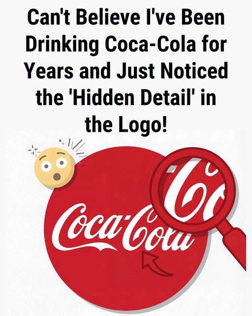
Some logos are so familiar that we stop really looking at them. Coca-Cola’s red-and-white script is one of those designs: instantly recognizable, printed on bottles, cans, signs, vending machines, restaurant menus, and holiday ads around the world. But every so often, someone points out a small detail in the lettering and suddenly the logo looks different.
Look closely at the flowing Coca-Cola wordmark, and you may notice a curved shape that some people interpret as a tiny smile. Once the idea is suggested, it can be hard not to see it. The question is whether that “smile” was intentionally built into the logo, or whether our minds are simply connecting shapes with feelings we already associate with the brand.
Where the Coca-Cola Script Came From
The Coca-Cola logo did not begin as a modern branding project packed with hidden messages. Its roots go back to the late 19th century, when Frank Mason Robinson, a bookkeeper and early partner in the business, created the distinctive lettering.
The style reflected Spencerian script, a graceful form of handwriting that was popular in that era. That explains the sweeping curves, elegant loops, and handwritten look that still define the brand today.