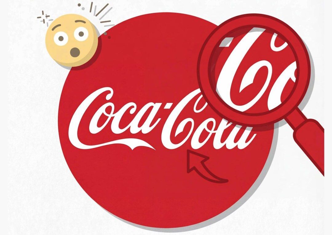
Few brands in the world are as instantly recognizable as Coca-Cola. Its flowing white script set against a bold red background has remained largely unchanged for more than a century, appearing everywhere from small local shops to massive city billboards. But recently, a new wave of curiosity has taken over online conversations, as many people claim to have spotted a subtle detail in the logo that completely changes how they see it.
At the center of this fascination is the elegant script itself—specifically the word “Cola.” Some observers believe the sweeping curve of the letter “C” forms what looks like a gentle human smile. Once noticed, it’s hard to unsee. The logo suddenly feels less like simple typography and more like a friendly expression, as if the brand is quietly greeting the viewer.
This observation has sparked debate. Is it a clever hidden design from the 1800s, or just a modern interpretation shaped by perception?
To understand this, it helps to go back to the origins of the logo. The iconic script was created by Frank Mason Robinson, a bookkeeper for John Stith Pemberton. Robinson used Spencerian script, a popular writing style of the time known for its elegance and flow. His goal was simple: create a distinctive and visually appealing name that would stand out.
There’s no historical evidence suggesting he intended to hide symbols or emotional cues in the design. In fact, the idea of embedding subtle visual tricks into logos didn’t really exist in that era. The “smile” appears to be an accidental outcome of the script’s natural curves rather than a deliberate feature.
So why do so many people see it now?
Keep reading…