Most of us recognize our favorite brand logos in an instant, but few stop to consider how much thought went into their design. Behind the colors, shapes, and lettering often lies a carefully crafted message meant to create lasting impressions and emotional connections—sometimes without us even realizing it.
From subtle symbols hidden in plain sight to clever uses of negative space, many iconic logos are designed to communicate far more than their surface appearance suggests.
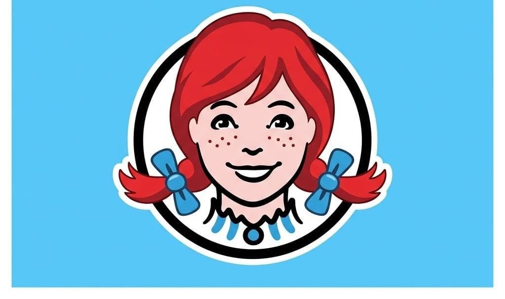
Take Wendy’s, for example. Some observers have pointed out that the ruffled collar beneath the character’s face appears to spell the word “MOM,” reinforcing the brand’s home-style image. Whether intentional or simply a happy coincidence, the interpretation has become a fascinating talking point among marketing enthusiasts.
Another frequently discussed example is Subway’s logo, where arrows integrated into the first and last letters suggest movement and speed, subtly reinforcing the idea of getting food quickly while on the go.
Then there’s Toblerone, whose mountain emblem contains the silhouette of a bear hidden within the design—a tribute to the Swiss city of Bern, often associated with the animal. It’s a detail many consumers overlook until someone points it out, after which it becomes difficult to ignore.
Keep reading…