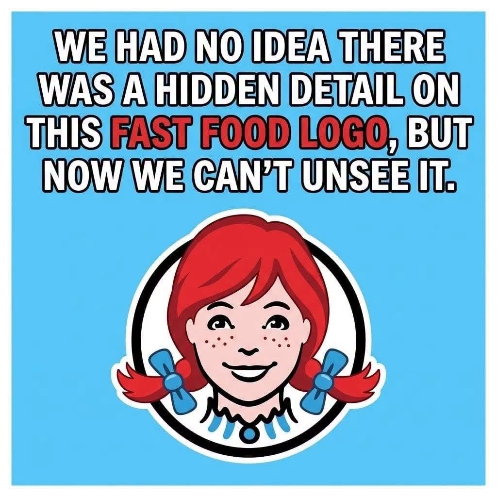
Wendy’s: A Design Inspired by Family
Wendy’s well-known logo features a portrait of a young girl named Wendy, based on the company’s founder Dave Thomas’s daughter.
The logo has changed over the years, but the character remains closely connected to the restaurant’s family-oriented identity.
Some people have claimed that the word “MOM” can be seen in the collar area of the logo. Whether viewers notice that pattern can depend on the version of the logo and how they interpret the lines.
Rather than being a secret message that everyone is expected to see, it is an interesting example of how viewers can discover additional shapes within a familiar design.
Toblerone: Look Closely at the Mountain
Toblerone’s packaging is instantly recognizable because of its distinctive triangular chocolate pieces and mountain imagery.
The mountain is associated with the Swiss Alps and the brand’s connection to Switzerland.
Look closely at the mountain illustration, however, and you may notice the outline of a bear within it.
The bear is a reference to Bern, Switzerland. The city has a long-standing association with the animal, which also appears on its coat of arms.
It’s a small visual detail that can easily disappear into the larger mountain design.
FedEx: The Arrow Hiding in Plain Sight
The FedEx logo is one of the classic examples of negative-space design.
At first glance, it simply appears to be the company’s name in bold lettering.
But look between the letters “E” and “x.”
A white arrow appears in the negative space.
The arrow works particularly well because it connects naturally with the company’s identity as a transportation and delivery business.
It doesn’t need to be large or obvious.
Once someone points it out, however, it becomes difficult to overlook.
Amazon: More Than Just a Smile
Amazon’s logo features a curved arrow beneath its name.
Many people initially interpret it simply as a smile.
But the arrow also stretches from the letter “a” toward the letter “z,” creating a visual reference to the enormous range of products available through the marketplace.
The design therefore works on more than one level.
It combines a friendly visual shape with a simple idea about product variety.
Baskin-Robbins: A Number Hidden in the Name
Baskin-Robbins has another well-known example of visual wordplay.
The letters in the “BR” portion of the logo can be arranged visually to highlight the number 31.
The number refers to the company’s historical association with a different ice cream flavor for every day of the month.
The current logo has evolved over time, but the idea remains one of the more recognizable examples of a number incorporated into a brand identity.
Toyota: Several Letters in One Symbol
Toyota’s oval emblem may initially look like a collection of simple overlapping shapes.
According to the company, the individual elements can be interpreted as letters from the word “Toyota,” while the overlapping ovals represent concepts connected to the relationship between the company and its customers.
The result is a logo that looks relatively simple at a distance but becomes more interesting when examined closely.
The Power of Negative Space
One of the most effective techniques used in logo design is negative space—the area surrounding or between the main shapes.
Designers can use this empty space to create secondary images without making the logo look cluttered.
The FedEx arrow is perhaps one of the best-known examples.
This technique works because the viewer first recognizes the main design and only later discovers the additional shape.
That small moment of discovery can make a logo more memorable.
Why Hidden Images Stand Out
There is a reason these details can feel so surprising once someone points them out.
Human vision is very good at recognizing patterns.
When we see a familiar logo repeatedly, we generally process it as a single recognizable symbol rather than examining every line and curve.
But when someone tells us that another shape is hidden inside the design, we begin looking for it.
Suddenly, something that was invisible to our attention becomes obvious.
This doesn’t necessarily mean the logo is secretly controlling our behavior.
It simply demonstrates how visual design can guide attention and make information easier to remember.
Not Every “Hidden Message” Is Intentional
It’s also important to separate confirmed design decisions from internet speculation.
Some hidden elements have been openly discussed by the companies or designers behind the logos.
Others are patterns that viewers have noticed and interpreted themselves.
A shape resembling a letter, face, animal, or word doesn’t automatically prove that designers intentionally placed it there.
This distinction matters because viral posts often present interpretations as established facts without providing reliable evidence.
Why Companies Use Clever Logo Design
A successful logo needs to accomplish several things at once.
It should be recognizable.
It should work at different sizes.
It should connect with the company’s identity.
And ideally, it should be memorable without becoming unnecessarily complicated.
A clever visual detail can help achieve that.
The best designs often communicate an idea without requiring a long explanation.
A transportation company can suggest movement.
A food company can reference its heritage.
A global marketplace can suggest variety.
A Swiss brand can connect its packaging to a local symbol.
These associations can strengthen a brand’s identity while remaining visually simple.
The Next Time You See a Familiar Logo
Try looking at familiar logos differently.
Instead of simply recognizing the brand, examine the letters, spaces, shapes, colors, and illustrations.
Ask yourself:
- Is there anything hidden in the negative space?
- Does a symbol connect to the company’s history?
- Does the shape communicate movement or another idea?
- Is an apparent hidden message officially documented?
- Or could it simply be a pattern your brain has noticed?
You may be surprised by how much information can be packed into a relatively small design.
Final Thoughts
Famous logos aren’t necessarily hiding secret messages designed to manipulate everyone who sees them.
But many are carefully designed visual identities containing clever references, symbolism, and subtle details.
Some are confirmed elements of the original design.
Others are interpretations that became popular after people began looking at the logos differently.
Either way, there’s something fascinating about discovering details that have been sitting in plain sight for years.
The next time you see a familiar logo, take an extra second to look closely.
You might discover something you never noticed before.