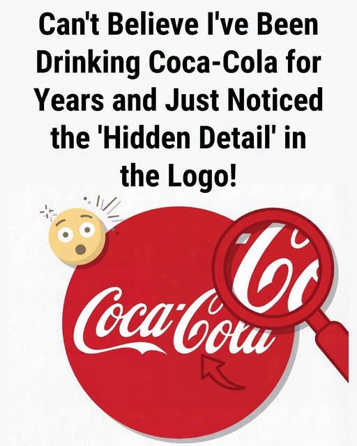
Yet something interesting happened afterward.
The public began attaching emotions to the design.
Over generations, Coca-Cola became associated with parties, meals, holidays, advertisements, sporting events, family gatherings, and moments of celebration. Those repeated associations can influence the way we perceive familiar imagery. A simple curve can begin to feel warmer. A familiar logo can start carrying emotional meaning far beyond the shapes and letters themselves.
That may explain why the supposed “hidden smile” feels so convincing.
The smile might not have been deliberately planted in the design at all. Instead, people may have discovered a shape that perfectly matches the feelings they already associate with the brand.
And that reveals something surprisingly powerful about visual design: sometimes, meaning isn’t created entirely by the person who draws a logo. It can also be created by millions of people who see it, remember it, and attach their own experiences to it.
So the next time you spot that familiar red-and-white branding, take another look.
Do you actually see a smile—or did someone online convince your eyes to find one?
What do you think? Tell us in the comments, and share this with someone who loves discovering the hidden stories behind everyday designs.