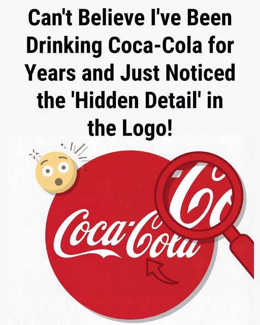
Once you notice it, you may never see the Coca-Cola logo quite the same way again.
Look closely at the familiar flowing script, and there seems to be a subtle curve beneath the name. To some people, that curve resembles a tiny smile—a welcoming expression hiding in plain sight. It’s the kind of visual detail that can send the internet into detective mode.
Was it intentional?
Was the designer secretly building a message into one of the world’s most recognizable brands?
Or are our brains simply doing what they naturally do best—finding familiar shapes and meanings in things that may never have been designed to contain them?
The real story is less mysterious, but arguably more fascinating.
The original Coca-Cola lettering dates back to the late 19th century, when bookkeeper and early Coca-Cola partner Frank Mason Robinson created the distinctive script used for the brand. Rather than beginning with a modern branding strategy filled with hidden symbols, the lettering reflected the elegant Spencerian script popular during that era.
In other words, the famous look grew from the handwriting and typography of its time.
There’s no solid evidence that Robinson deliberately tucked a secret smile beneath the name. No reliable historical record establishes that the curve was intended as a coded message about happiness, friendship, or celebration.
Keep reading…