A Legacy That Endures
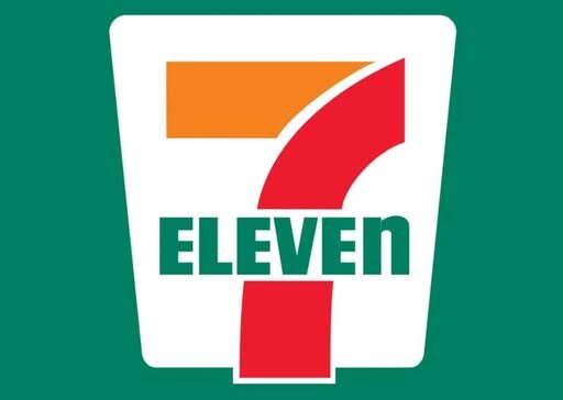
Over the years, the logo has remained consistent. The number seven, vibrant colors, and that distinctive lowercase “n” continue to make 7-Eleven instantly recognizable. Even if most customers never consciously notice the detail, it creates a subtle signature that reinforces brand identity and memorability.
Design Lessons in Plain Sight
The story of the 7-Eleven logo reminds us that small design choices matter. One letter, one tweak in typography, can define a brand for generations. What seems tiny at first glance can quietly shape how millions perceive a familiar symbol.
Next time you pass a 7-Eleven sign, take a closer look—you might just notice the lowercase “n” and appreciate the thought behind a design you’ve seen countless times.
💡 Curious? Look closely next time you see the 7-Eleven logo and share your thoughts—sometimes the smallest details make the biggest impact!