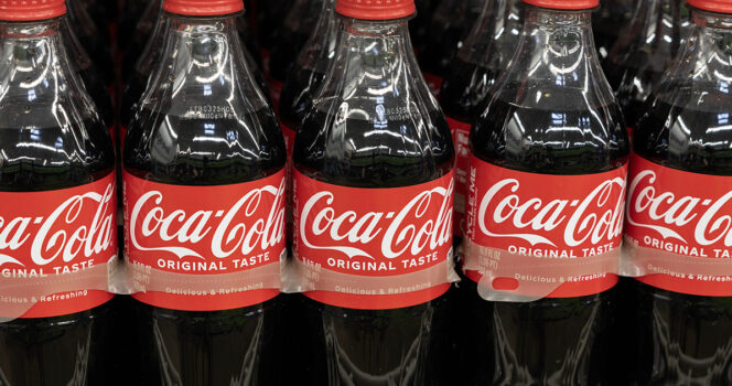
Coca-Cola’s red-and-white logo is one of the most familiar images in the world, but a small detail in the design is getting renewed attention from people who say they had never noticed it before.
The soft, flowing script has been part of Coca-Cola’s identity for decades, appearing on cans, bottles, vending machines, restaurant fountains, advertising campaigns, and store shelves across the globe. Now, a branding expert has suggested that one part of the logo may be doing more than simply spelling the company’s name.
The Detail Hidden in Plain Sight
Richard Lau, president of LOGO.com, has pointed to the second “C” in the Coca-Cola logo as a subtle visual cue. According to Lau, the curve of that letter can be read as resembling a smile.
His view is that the effect works on a subconscious level, helping connect the brand with ideas of happiness and enjoyment. That fits closely with the kind of messaging Coca-Cola has used in its advertising for generations.