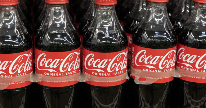
Once the possible “smile” is pointed out, some people say it becomes difficult not to see it. Others are less convinced, arguing that it may simply be a case of people finding meaning in a design that was already visually strong.
Why the Coca-Cola Logo Still Works
The Coca-Cola Company was officially established in 1892 after pharmacist Dr. John Pemberton’s creation was sold to businessman Asa Griggs Candler. Since then, the drink has grown from an American product into a global brand. Coca-Cola reports producing 2.2 billion servings every day.
That scale makes the company’s visual identity especially important. A logo used in so many countries has to be instantly recognizable, easy to reproduce, and emotionally consistent across different languages and markets.
The classic Coca-Cola look, introduced in 1969, has become one of the most durable examples of brand design. While the company has launched many different drinks and packaging styles over the years, the central logo has remained closely tied to the original product.
The Bigger Picture
For major consumer brands, a logo is more than decoration. It can influence how shoppers recognize a product, how quickly they trust it, and what emotions they associate with it. That has real business value, especially in crowded grocery aisles where packaging and brand memory can affect buying decisions.
Coca-Cola’s design has also become part of popular culture. Even President Donald Trump has made headlines for his reported fondness for Diet Coke, including reports that he drank 12 cans a day and used a special “Coke button” in the Oval Office.
Whether the curved letter was intentionally designed as a smile or is simply a clever interpretation, the reaction shows how closely people still examine familiar brands. Sometimes the most interesting details are the ones sitting in front of us for years.
Next time you see a Coca-Cola can, it may be worth taking one more look at the logo.